Visual Language 9/7/22
Taste, Tested
I’ve never really tried to articulate my design tastes before, but a few influences and preferences immediately come to mind. In the interest of not droning on endlessly about one, I’ll make a list.
- I tend to prefer design that feels reproducible. I think this stems from my screenprinting experience. Before that I’d use every possible Photoshop feature to make designs of my own that were busy and garish. Now I much prefer to work in monochrome or limited color, often thinking of visuals in layers, like an accumulation of shapes and colors done with a few passes. This means my designs tend to be bold and flat, for better or worse.
- This helps explain why I gravitate toward a lot of handmade design, like old painted signs, and toward early digital or midcentury-to-80s print design that eschewed things like gradients and photographs in favor of flat shapes and illustration.
- While I do like simplicity, I strongly dislike tech’s embrace of corporate memphis, a flat, lightly abstracted, and blandly pleasant style that feels, to me, like the natural endpoint of well-intentioned designers repeatedly having their work A/B tested and boardroom-meddled to death.
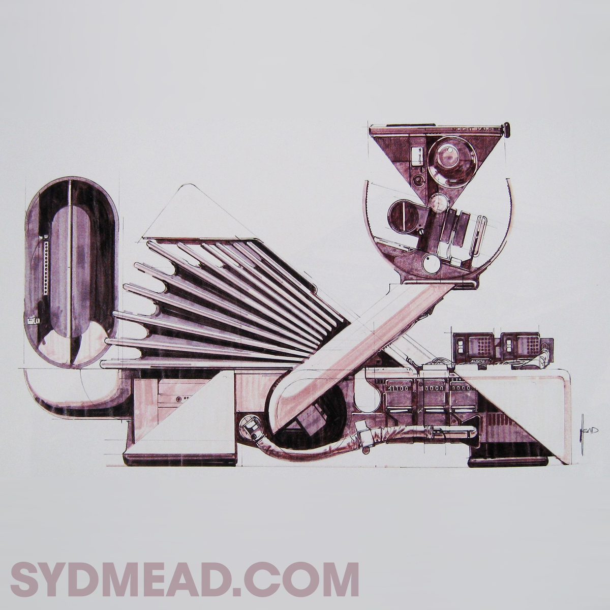
- I used to be very fond of industrial sci-fi aesthetics, like the work of Ron Cobb on “Alien” and the illustrations of Syd Mead. This probably bubbled up backwards from video games and TV shows in the 90s and 00s that drew heavily from these sources.
- I can trace a few design interests to music: I think Rob Sheridan’s work with Nine Inch Nails helped fuel a passing teen obsession with glitch art, and because I’m a frequent doodler, there’s something very appealing about the collages and scribbly compositions from Radiohead and Stanley Donwood in the early 00s.–9/12/22

